Opportunities and Barriers in Sustainability
UNCLEAR PATHWAYS
Individuals aspiring to build a career in sustainability face significant barriers. Without clear pathways or accessible guidance, they struggle to find direction in this growing field.
GROWING DEMAND
Sustainability is rapidly expanding across industries like agriculture, energy, and construction. Consumer demand, governments enforce initiatives, and companies prioritize sustainable practices. However, there’s a lack of career tools specifically tailored to sustainability.
FIELD COMPLEXITY
The field's complexity and diversity make it difficult for users to identify their niche. Limited resources, such as mentorship availability, and the challenge of balancing user and technical needs further complicate the process.
Empower Your Career in Sustainability
ROLE
UX designer
UI designer
Researcher
ABOUT
Personal project
at CareerFoundry
TIME
4 month
Full time


GREEN GURU
Success & Outcomes
VALIDATED BY USERS
The app concept resonated strongly with users during successful usability tests, where positive feedback affirmed its value and usability. Insights from the feedback guided further iterations, improving the app’s overall functionality and user experience.
DESIGN FEASIBILITY INSIGHTS
Collaboration with the developer confirmed that the designs were feasible and accounted for edge cases and technical requirements, ensuring a smooth handoff to development.
FINAL DELIVERABLES
MVP Delivery: +60 high-fidelity screen, 4 flow MPV
Research Insights: Multiple user and market insights
Design Documentation: 2 personas, user flows, journey maps, sitemaps
Style Guide: +20 elements for a component library.
4 micro-interactions


MARKET ADVANTAGE
The Mentoring Club shows in the first five results of a “Sustainability mentor.” Service is completely free. Mentors are available for any users with access to the internet. Over 3500 mentors come from various industries, languages, and domains.
OVERALL STRATEGY
The Mentoring Club provides a free and open community where mentors from various industries and domains advise those eager to learn, grow, and develop. Platform provides a flexible system where mentees can schedule sessions based on mentor calendar availability.
KEY OBJECTIVE
The platform aims to ease access to learning by mentoring individuals seeking advice and leaders looking for sparring partners in various fields such as product management, engineering, leadership, company culture, team scaling, and a few mentors in sustainability.

The Mentoring Club
-
Improve the search functionality and filtering options on the platform
-
Improve search ambiguity in the search bar
-
Introduce paid mentorship sessions
-
Give more information about a mentor in relationship to the platform (session numbers, joining date)
-
Better marketing strategy to increase platform awareness
OPPORTUNITIES
O
-
Volunteer-based mentorship with open membership may compromise the quality and legitimacy of the mentoring experiences
-
A growing number of mentors on social media offering free and paid educational materials and 1:1 mentoring may lead to a decrease in user acquisition for The Mentoring Club
T
THREATS
W
WEAKNESSES
-
Diverse but small pool of mentors in the sustainability category
-
Filtering options for mentors are limited. No way to filter mentors by active status, years of experience
-
Limited availability, since mentors offer their time voluntarily
-
Room for improvement in overall application UX
STRENGTHS
S
-
A diverse pool of mentors from various industries, languages, and domains
-
The platform is free to use
MARKET ADVANTAGE
Clarity.fm's market advantage lies in its curated network of 14,000 carefully curated experts. The platform is easy to use, making it convenient for individuals or businesses to get the necessary advice. Clarity's pricing model is designed to fit anyone's budget. Prices typically range from around $1 to $15 per minute.
OVERALL STRATEGY
Clarity.fm's strategy is to curate various experts across various business categories and provide an easy-to-use platform for individuals to find, schedule, and pay for expert advice over the phone. The platform also allows experts to join as advisors and get paid for their advice.
KEY OBJECTIVE
The platform provides a space for individuals and businesses to connect with and pay for expert advice across various business categories, including sustainability, helping them be more productive and grow professionally.

Clarify.fm
-
More features like personalized matchmaking, since this platform takes a 15% fee
-
Fix web app
-
Introduce other price models
-
Better marketing strategy to increase platform awareness
OPPORTUNITIES
O
-
Increasing competition from similar online expert advice platforms that offer lower fees or different price models
-
A growing number of mentors on social media offering free and paid educational materials and 1:1 mentoring may lead to a decrease in user acquisition for Clarity.fm
T
THREATS
W
WEAKNESSES
-
The site is geared more towards one-time solution provision and not as focused on building meaningful client relationships
-
The price-per-minute model may lead to rushed and disconnected calls, lacking a full understanding of the issue
-
The platform charges a 15% fee, which is a lot, given that it does not have much hosting or an emergency line for users
-
The web app did not function on the Safari browser
STRENGTHS
S
-
Large and device pool of mentors from various industries and languages
-
The platform is easy to use
-
A wide range of prices allows users to choose an expert that fits their budget
-
Experts need to apply and be approved. Plus for credibility.
-
Experts can share a video link in their profile, which makes it easier to understand their personality

Competitive analysis conclusions

COMPETITION
Our app stands out from competitors like LinkedIn Learning, The Mentoring Club, and Clarity.fm as it specializes in sustainability careers. This unique selling proposition sets us apart. Moreover, while GreenBiz and Net Impact offer sustainability-focused mentoring, our app provides greater personalization and flexibility.
RISKS
Targeting a niche audience limits scalability. Expanding to those seeking a career change, unaware of opportunities in the field, is crucial. Yet, sustainability's growth relies on unpredictable government regulations and funding.
OPPORTUNITIES
Sustainability is gaining global recognition, yet many career opportunities still need to be discovered. The rising demand for sustainable products and practices prompts businesses to prioritize sustainability, leading to growth opportunities for career coaching and mentorship services in this domain.

01
02
03
03. GOAL
Documenting users' pain points with existing mentoring platforms and general attitudes and opinions about finding a career in sustainability and climate sectors. Understand their pain points and frustrations. Learn about their previous experience.
02. GOAL
Identify why users seek a mentorship, and what they want to get out of the process. Their general attitude and preferences when it comes to the mentorship process.
01. GOAL
Gain a comprehensive understanding of users' attitudes, preferences, and behaviors when seeking out and engaging with a mentor, and how users can determine if a mentor aligns with their needs and expectations.
Research Goals


Survey Results
TARGET AUDIENCE
I contacted the survey via Jotform. It was shared on climate-focused Telegram groups and Slack channels, and 20 people completed it. The overwhelming majority of participants were between the ages 25-34 at 65%, followed by 18-24 at 20% and 35-44 at 10%
25%
of participants had a mentorship
experience, regardless of the fields
65%
of participants think that having a mentor is extremely important
90%
of participants choose “seek career advice and guidance from a mentor” as a main reason for a mentorship
70%
of participants choose “clear and concise communication” as the most important factor when trusting a mentor
60%
of participants have a general idea about the area of interest in the climate or sustainability field, but not a specific goal
75%
of participants find search for a mentor in sustainability sectors challenging
EXPERIENCE DISPLAY
Numerous users have preferred mentors with slightly more experience in their career path, 5-10 years. To accommodate this, displaying a mentor's expertise prominently on their profile is important, and incorporating a feature allowing users to filter mentors based on their years of experience is important.
SMART FILTERS
To cater to our users' diverse preferences regarding mentors, a robust filtering system must be developed, allowing users to select based on industry in sustainability, location, language, gender, desired study skills, minimal rating, and maximum price range.
SKILLS ALIGNMENT
Users expressed a need to work on their soft and managerial skills as well as other skills. To ensure an excellent mentor-mentee match, it’s important to highlight mentor-relevant skills and experience. Adding a skill set to a mentor profile through tags can help match mentors and mentees effectively.
AVAILABILITY
To improve user experience and facilitate quicker connections, I will introduce the 'ASAP Availability' filter for mentors. This feature will enable users to easily find mentors ready to engage within the next 14 days, promoting effective mentor-mentee pairings and empowering users to embark on their learning journeys promptly.
FEEDBACK SYSTEM
A qualitative feedback and review system offers mentors and mentees an accountability tool, promoting meaningful feedback. This cultivates a culture of constant improvement, elevating the overall quality of the mentorship experience—a sentiment echoed by all interview participants.
COMMUNITY
Users value community and access to like-minded people. Connecting them with mentors and fellow mentees on the platform can be a solution.
In consideration of prioritizing the Minimum Viable Product (MVP) and the time constraints, I have opted to postpone the development of this feature to a later phase.
Interview Insights & Core Features

“I've always had a passion our planet, but circumstances forced me to pause my career in climate. Now, I'm determined to build a sustainable future for next generations”

AGE
30
JOB
Project Manager
STATUS
Single mom
LOCATION
Berlin
BIO
Corporate worker with an environmental science background. She seeks an impactful career aligned with her values. She was always inclined toward agriculture and food systems, but she is willing to explore all the opportunities.
DEVICE & INTERNET USAGE
Desktop
Phone
Social Media
Tech Know how
MOTIVATIONS
-
Motivated by a desire to have a career that aligns with her values, making a real difference and contributing to solving environmental challenges
-
Ensuring a sustainable future for her kid
-
Desire to self-improve and learn new skills
FRUSTRATIONS
-
The lack of well-paying job opportunities aligns with her values.
-
Lack of transparency when it comes to salary negotiations
-
Feeling overwhelmed while researching the sustainability job market
GOALS & NEEDS
-
Achieving work-life balance as a single mother, balancing her career with her responsibilities as a parent
-
Improved time management and negotiation skills
-
Seek guidance and support in understanding the current job market and its opportunities
Eleanor
Sustainability Job Seeker


“I am a generalist. While I may not have specific technical skills, I'm eager to find my best fit in the sustainability market”

AGE
33
JOB
Marketing Specialist
STATUS
Single
LOCATION
New York, NYC
BIO
Skilled communicator with a background in marketing. Recently Alex became passionate about climate issues. He wants to find the best fit and has done a bit of research. He believes that entrepreneurship can be a powerful tool for driving sustainable change.
DEVICE & INTERNET USAGE
Desktop
Phone
Social Media
Tech Know how
MOTIVATIONS
-
Growing demand for sustainability products and services in the market
-
Opportunity to make a positive impact on the environment and society through entrepreneurial endeavors
-
Expand the network and engage with like-minded individuals, and exchange values.
FRUSTRATIONS
-
Dislike the process of “pitching himself” and need to improve presentation skills
-
Lack in-depth knowledge in certain areas of the field due to his background
GOALS & NEEDS
-
Seek a connection to exchange values and guide him in his sustainability career
-
Identify the best fit in the sustainability job market as a skilled communicator and self-described generalist
-
Venture into creating a sustainable product through entrepreneurship
Alex
Entrepreneur Enthusiast
Card Sorting
I conducted open card sorting via OptimalSort. Participants had to sort 19 cards from the initial side map to test whether my groups made sense and whether the initial naming conventions were working and transmitting the function correctly.
on avarage
6 MINUTES
7 PARTICIPANCE
created by participance
2 AND 6 CATEGORIES


RESULTS
The similarity matrix revealed 5 distinct groups: Account setting & preferences, About the business, Mentors & Search, Messages, and Mentor Sessions.
The 'Leave a Review' feature was combined with the 'About the Business' section to encourage users to share their feedback. In the app, it will be renamed 'Review a Session' to avoid confusion.
The term 'Search Results' does not refer to a page but rather a collection of relevant information based on the user's search query.
'List of Mentors' perfectly encapsulates this concept and can be used to represent search results.
I will change the name to 'Notification Settings' to fit it into the account settings group, but also create a ‘Notification’ page, where users can go through the notifications.
USABILITY TEST GOAL
1. Evaluate the overall user experience and identify any usability issues or challenges
2. Assess the effectiveness of the user interface in facilitating user tasks and navigation
3. Gather feedback on core features to inform further improvements and enhancements
OVERVIEW
The remote moderated usability test was conducted with 6 participants, completing 4 tasks.
-
Sign Up and complete onboarding.
-
Search for a mentor using filters and book a session
-
Have a booked session
-
Exchange messages with saved / favorite mentor
The errors during the test were assessed using Jakob Nielsen's rating scale and were documented using Rainbow Spreadsheet
Usability Test


Usability Test Results
TASK 1
Sign Up and complete onboarding
ISSUES
-
Onboarding and the filter option ‘mentor’s level’ caused confusion, frustration, and doubt
-
Option “grow personally” was damaging credibility
EVIDENCE
-
5/6 participants were confused by the ‘mentor’s level’ filter. They found the mismatch between profiles showing ‘years of experience’ and the filter showing level frustrating. (Rating 3)
-
3/6 pointed out that ‘Grow Personally’ is a strange option (Rating 2)
SUGGESTED CHANGE
-
Change ‘mentor’s level’ to ‘years of experience’ in the onboarding and search filters
-
Make it a slider for the user to have precise control when choosing a mentor's experience level
-
Change “Grow Personally” to “Upskill and Learn” to avoid confusion


ISSUES
-
UI of a booking calendar caused confusion and frustration
-
Users find it difficult to scan the mentors' card
EVIDENCE
-
4/6 struggled to find an available date to book a mentor; participants clicked on an unavailable date, and others took too much time. (Rating 4)
-
The task to find a particular mentor was completed successfully, but users struggled to scan information on a mentor card (Rating 3)
SUGGESTED CHANGE
-
Make the UI of the calendar more scannable, make available more pronounced and unavailable faded
-
Find an alternative to the original design of a mentor’s card to avoid the user’s cognitive overload
TASK 2
Search for a mentor using filters and book a session


TASK 3
Have previously booked session
ISSUES
-
Users were frustrated that clicking on the ‘upcoming session’ card did not lead them to the session details page
-
Users find it difficult to scan the session details page
EVIDENCE
-
3/6 pointed out that pressing on a session’s card should lead to the session detail page, avoiding entering the session menu (Rating 2)
-
User feedback revealed that although users could complete tasks associated with the booking page, they struggled to process the information effectively. (Rating 2)
SUGGESTED CHANGE
-
Link the session card to the session detail page
-
Find an alternative to the original design of a session detail page to avoid user’s cognitive overload
RE-DESIGN (SESSION DETAILS PAGE)
-
One CTA: Reducing the number of CTAs streamlines the user experience, minimizing decision fatigue and making it clearer for users to understand the primary action you want them to take, ultimately improving usability
-
Enhanced visuals: The new layout is similar to the mentors' and walking checkout pages, creating better grouping with dividers. There is a description on the left and information on the right.
-
Add to external calendar: the feature was integrated based on participant feedback during usability testing.


TASK 4
Exchange messages with a saved / favourite mentor
ISSUES
-
Users couldn’t find their saved ‘favorite’ mentor
-
Users were frustrated that they did not end up on their dialogue page after they sent messages
EVIDENCE
-
3/6 participants couldn't find their favorite mentors without moderator interference (Rating 4)
-
3/6 participants wanted to end up on the dialogue page after they sent a message (Rating 2)
SUGGESTED CHANGE
Change ‘favorite mentors’ to ‘my favorite mentors’ for clarity
Redesign the exchange message flow


Usability Study Takeaway
Undertaking a usability test for a project proved an enriching and ultimately successful experience. From planning and scriptwriting to comprehensive documentation, every aspect was meticulously executed. However, amidst the success, several key takeaways emerged, shedding light on areas for improvement and valuable lessons learned.
RIGHT PARTICIPANTS
I discovered that feedback from individuals deeply immersed in the domain yielded particular insights that might otherwise be overlooked. This underscored the importance of seeking input from users with varied backgrounds and experiences in the same domain to ensure comprehensive insights and informed decision-making.
NAVIGATING TRUST WITH LABELS
Beyond mere functionality and navigation, the words users encounter influence their trust and credibility in the product. Poorly chosen labels can undermine the entire system's credibility, eroding user trust and hindering adoption. This realization emphasized the need for careful attention to detail in crafting clear, concise, and credible language throughout the user interface.
STRATEGIC DESIGN
Design extends beyond what users see to what they don't see. By intentionally directing users' focus toward essential elements and minimizing distractions, usability and comprehension can be significantly enhanced. This underscores the critical role of employing best practices in proximity, grouping, and visual hierarchy to create intuitive and impactful user experiences.


Iteration Process X Design Evolution
I went through several iterative stages in the design process, starting with low-fidelity sketches, followed by mid-fidelity wireframes, and finally high-fidelity screens. The use of high-fidelity screens allowed for realistic usability testing, resulting in the best possible experience and accurate outcomes during the tests.

Working with a Developer
Loading state: A Skeleton is a better option than a spinner.
Feedback notifications: Toast. (Add to favorite)
Error states
MISSING ELEMENTS & SCREENS
APPROVED ELEMENTS
-
The flows are clear and logical. Figma files are organized, and the names are clear. Accents are well organized and labeled
-
The design adheres to logic and consistency and is easy to implement. There are no technically unfeasible elements or animations
-
Great component library and design system


Design Revision: Mentors page
When I thought of a desktop version of this page, I realised there will be an issue with a profile image. Also design felt flat. and needed more polish.
THE ISSUE
-
Responsive design: Realising the scaling issue of the original design with different devices, I adapted it using a responsive framework. This ensured mentor photos were displayed correctly across all screen sizes, addressing potential distortions on larger devices and providing a seamless user experience.
-
Prioritizing CTA: CTA and session price are fixed at the bottom of the page for user convenience. This ensured that users were fully aware of session costs and could easily book a session with just a thumb's reach. By providing quick access to crucial information, the booking process was streamlined without the need to search for pricing details elsewhere in the mentor's profile.
-
Better grouping: I focused on improving the visual hierarchy by grouping sections and separating them. I believed this would create a more organized and user-friendly layout.
REVISION REASONS

Color
#003133
#2C615E
#044447
#B5C9C9
#5A7876
#E9F4F4
Green Guru is connected to sustainability and climate, so a greenish color palette is essential. Dark teal is a rich, deep color between blue and green. This combination of blue and green, found in nature like the sky, water, and forests, evokes positive emotions for the app's purpose. To create better harmony, I reduced saturation for lighter tones.
Teal's reserved nature promotes clarity, open communication, and practical thinking. As it is not overly evocative, teal is well-suited for applications designed to provide stress relief. Other teal associations are calmness and stability, emotional balance, rejuvenation and healing, Sophisticatedness and depth, and communication and openness.
Salmon is an accent color, a warm pink-orange shade. Salmon is friendly and approachable and evokes hope. It symbolizes health, vitality, and persistence, maintaining a connection to nature. It is found in nature to add depth and visual interest to the color scheme.


#6E9290
The teal tones are the main primary colours of the app and will be use for majority of the white elements. #003133 shade will be used for text. #6E9290 for less important text. #B5C9C9 for pills. #E9F4F4 for background. #044447 is used for CTA, tabs ans navigation menu selected icon.
PRIMARY
#F7807C
#0E3A3A
ACCENT
SUCCESS
WARNING
ERROR
Used for favourite icon, star icon, and notification badge.
GRADIENT
Used for backgrounds.
#195C61
#001516
#FBFCFC
NEUTRALS
#FBFCFC background cards colour. #001516 is use for any black elements.

photo by me


Micro-interactions
DEVELOPER FRIENDLY
Micro-interactions enhance user experience and interface design, making even the most mundane tasks engaging and delightful. Here is a simple yet impactful example: a menu tab animation. These subtle animations captivate the user's attention and provide crucial feedback and guidance, fostering a more intuitive and enjoyable interaction. Developers find this micro-interaction relatively straightforward to implement, making it a cost-effective means to elevate the overall user experience.
Typography
San-Serif Plus Jakarta Sans is modern casual font. It font offers a contemporary interpretation of geometric sans serif styles. It draws inspiration from typefaces like Neuzeit Grotesk, Futura, and 1930s grotesque sans serifs, resulting in a fusion of modernity and timeless appeal.
ABCDEFGHIJKLMNOPQRSTUVWXYZ abcdefghijklmnopqrstuvwxyz 0123456789 !@#$%^&*()
Aa
Footer
Font size: 10px | Line height: 12px| Tracking: 0%
Captions
Font size: 12px | Line height: 14px| Tracking: 0%
Paragraph 02
Font size: 14px | Line height: 20px| Tracking: 0%
Paragraph 01
Font size: 16px | Line height: 24px| Tracking: 0%
Heading 04
Font size: 20px | Line height: 28px| Tracking: -2%
Heading 03
Font size: 24px | Line height: 32px| Tracking: -2%
Heading 02
Font size: 32px | Line height: 40px| Tracking: -2%
Heading 01
Font size: 40px | Line height: 48px| Tracking: -2%
Style Guide
Styles
Regular
Medium
Semi Bold
Bold
Medium Italic
EASY AND DELIGHTFUL
When a user selects a minimum rating, a small animation of stars highlights the selection, adding a touch of delight to the experience. This seemingly minor feature is a vital visual cue that reinforces the user's choice and ensures that their input is accurately recognized.

HELPS TO TELL A STORY
This is an example of a landing page illustration animation. This animation captivates the user's attention and weaves a compelling narrative about the product, bridging the gap between information and engagement. By infusing movement and interactivity, we mitigate the risk of a static, uninspiring interface and, instead, create an immersive journey that communicates the essence and value of the product effectively.
Prototype

FEEDBACK AND CONTROL
Toast notifications are pivotal in enhancing the user experience by providing timely and unobtrusive information. These brief, pop-up messages offer users immediate feedback, alerting them to important updates, events, or actions within an application or system. The significance of toast notifications lies in their ability to convey crucial information without disrupting the user's workflow.

Lessons learned
As this was my first end-to-end UX/UI project, I embarked on a journey of profound professional growth beyond grasping fundamental principles like empathizing with users and harnessing the power of usability testing and user research. Here, I wish to delve into specific tools, techniques, and principles that elevated my design process, leaving me awe-struck by their potential and impact on creating meaningful and effective user experiences.
BUSINESS AND USER GOALS
As UX designers, we must balance the needs of a business, its customers, and the constraints of technology. Throughout the design process, I kept the primary business goal in mind: for a mentee to schedule a session with a mentor. This led me to prioritize the booking call-to-action on the mentor's page, making the message button easily accessible and prominent for users.
REVISITING THE DATA
Emphasizing the user is one of a UX designer's most crucial skills. During this project, I learned the value of regularly revisiting the data to ensure my design decisions were grounded in real user needs and preferences. This practice saved me from overlooking a significant insight that emerged during the research phase, and I swiftly incorporated it into the prototype just before the usability test.
SKETCH AND ITERATE
Paper prototyping is a powerful tool for ideation. It helps visualize concepts quickly and focuses on the bigger picture, avoiding being consumed by details. Sticking to the design process and resisting the temptation to jump to the first solutions and ideas is essential. Through exploration and iteration, you can uncover surprising outcomes that would not have been possible otherwise.
USE COMMON DESIGN PATTERNS
Incorporating common design patterns in my work is essential. Drawing inspiration from existing apps helps me create a familiar and intuitive user experience. I reduce cognitive load by utilizing familiar interactions and visual cues, allowing users to focus on their tasks. Studying successful design solutions from other apps enhances my skills and helps me create more effective and engaging designs.
AFFINITY MAPS
Affinity mapping is a new, powerful tool in my UX toolkit. It enabled me to synthesize vast amounts of data and efficiently communicate research findings with others. I had the opportunity to employ this technique twice during the project, and its impact on my work cannot be overstated. Affinity mapping allowed me to uncover valuable insights and guide the design process with newfound clarity and precision.
UI CONSISTENCY
I gained a deeper understanding of consistency and visual hierarchy in UI design, using grids for harmony and organization, maintaining consistent spacing for flow and intuitive navigation, and employing uniform font sizes and thickness for enhanced coherence and readability. This knowledge is valuable for my visual design and crucial for a smooth handoff to developers.

Thank you!
I’d like to hear your feedback!
Feel free to drop me an email to:
pauline@paulinegefin.net
Future Steps
The primary objective of this project was to create a minimal viable product (MVP) that would serve as a solid foundation for future development and growth. While I have successfully achieved this initial goal, it is essential to acknowledge that numerous aspects, features, and functions require further refinement and enhancement.
MENTORS' PLATFORM
Recognizing that mentors are the foundation of our platform, the next step is to focus on understanding their perspective and building their side of the platform. By gaining valuable insights from mentors, we can enhance the mentorship process, making it even more rewarding and fulfilling for both mentors and mentees.
PRICING STRATEGY
I want to introduce a subscription model for individuals seeking long-term mentorship. This will provide sustained and personalized guidance to our users, fostering a deeper and more impactful learning experience.
BUILDING A COMMUNITY
The research and insights gathered from interviews and surveys emphasized the importance of fostering a sense of community among users. To meet this demand, the next step is to create a vibrant and engaging community within the Green Guru platform.
UI Alternatives
REASONS
I chose a clean white background with deep cyan as the main color and bright coral as the accent color for the blending page. This design offers simplicity, user familiarity, and visual coherence. It ensures an enjoyable and intuitive user experience while avoiding cognitive overload and maintaining eligibility for a broad audience.

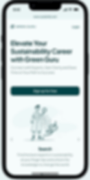
What is Green Guru?

Green Guru is a Web App that connects users aspiring to a career in sustainability or seeking career advancement with mentors for expert advice and guidance.
So that they can get encouragement and clarity about their career path and save time and effort.
My Role
I was the project's solo UX/UI designer and researcher. My goal was to create a high-fidelity MVP of the GreenGuru web app, originally scoped for three user flows, I proactively designed an additional flow to prepare for scalability and user needs.
Driven by Design Thinking
PROCESS
I led the end-to-end design process, guided by design thinking principles. This included extensive primary and secondary research, such as user interviews and surveys, to understand needs and pain points. I maintained a consistent feedback loop with users throughout the process, ensuring their input informed every design decision.
I created personas, user flows, and sitemaps and iteratively designed the app from low-fidelity wireframes to pixel-perfect mockups in Figma. After conducting a successful usability test, I refined and updated the designs based on user feedback.
